In John's Words: Behind the Illustration
Have you noticed our new passion for illustration? We’re loving these spontaneous, hand-painted images of the John Wind gal and her world, including the Paris skyline, a little bubbly, dreamy landscapes, florals, and rich night skies…
Illustration was once the norm in the fashion world. From the 19th through the mid 20th century, it’s simply how designers and stores communicated.

When I was growing up, my grandfather had a men’s clothing store in Haifa, Israel. His logo was always this Mad Men-era graphic. The store opened in the 1950’s, and his fabulous logo just kind of hung out there, ignoring the passage of time.
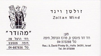
“MEHUDAR”, The Well Dressed Man
When Hilary Jay and I founded Maximal Art in 1985, we liked the idea of echoing the past. Our letterhead featured a gorgeous 19th century etching running down the left side of the page (hand tinted to freshen things up a bit).
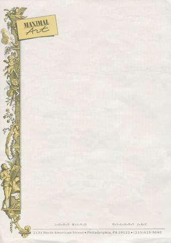
Maximal Art Letterhead
And a few years later when we started a line called Sam & Joe Tassel, Hilary’s father Stanley, an incredibly talented artist, hand drew the collection for all of our marketing material.

Sam & Joe Tassel Postcard C. 1989
But over the decades, as styles changed and photography grew increasingly ubiquitous (partially a fashion thing, partially a technology thing), drawings started to look quaint and old fashioned. The digital revolution temporarily put an end to the handmade, with a focus on the future, not the past.

1988 Vogue Laise Adzur ad featuring Maximal Art belt/neck
In recent years there has been a rebellion of sorts; one that has led us to crave the artist’s touch once again. The maker’s movement is flourishing both in spite of and alongside the 3D printing revolution. It’s a pretty exciting moment right now, where literally anything goes.
For us, 2016 marked the introduction of our new branding campaign. Working with the Philadelphia agency M, we dug deep to articulate the essence of the John Wind brand. What did we stand for? What threads have been consistent since 1985 (31 years ago!), and what’s most relevant now?
Two simple words seemed to answer these questions best: Modern Vintage. This means drawing inspiration from the past, but always interpreting it in a fresh, current way.
When it came to a visual identity, the vintage piece was the rich and illustrious tradition of fashion illustration. The modern bit was laying the jewelry on top of the illustrations, then photographing the tableaux (or dropping the photos in digitally). And keeping a light, bright touch throughout. The best of both worlds, and a assemblage approach perfectly in-line with John’s passion for collage.

For our Holiday 2016 catalogue, we turned to John’s assistant and our artist-in-residence Madi to paint an assortment of festive and evocative backgrounds. Working in watercolors, acrylics, pencil, and everyone’s favorite glitter, Madi conjures a pretty, happy world for our jewelry to live in. We love how the washes of color create a soft, feminine mood, setting off the rich tones in the jewelry itself.

We think the overall effect mirrors the creative, stylish, and independent spirit of you, our customers… and we hope you agree!
Feeling Inspired? Shop Our Holiday Catalog Now!
LOVE Madi’s work! You are LUCKY to have such a talented young lady on your team!!
Leave a comment